


Weston Wine Company crafts delicious wine from Missouri grapes and is famous for their playful cupcake pairings and wildly fun group events. Recently under new ownership, WWC was ready for a new brand identity that would help build strong connections with their target customers.
In the discovery phase of this project, we uncovered the unique and snarky bits of WWC’s tone and persona then worked thru several phases to bring this to life.
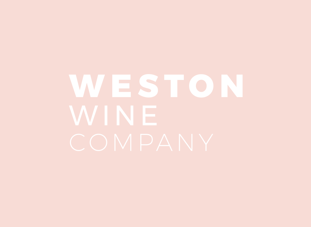
The bold, feminine, playful color palette helps this new brand speak without words. The use of phrases that are edgy yet classy create an honest and welcoming tone. The mix of simple, blocky sans type and a very fluid script show that you can be grounded and let your hair down at the same time.
Along with creating a solid branding system for WWC to pull from as they develop their new identity in the marketplace, we also worked to develop new packaging, wine labels and environmental graphics.
We’re excited to share more of these elements with you as they roll out. For now, here’s a sneak peek at the new Weston Wine Company brand and style.
Site Design and Social Graphics by Weston Wine Company, based on the new brand.